Minn.
App concept design.
I do not like this button.
Ursula.
︎
This is the showcase on Minn, a concept app developed for a well known digital agency on Barcelona. If you keep reading, you will find:
1. Start point.
2. Interviews.
3. Competence.
4. Personna.
5. Design.
6. Final conclusions.
7. Bonus track.
Otherwise, you can jump to the images clicking here.
1. Start point.
2. Interviews.
3. Competence.
4. Personna.
5. Design.
6. Final conclusions.
7. Bonus track.
Otherwise, you can jump to the images clicking here.
⏰️⏰️⏰️
1. STARTING POINT.
I was asked for a quick approach to a brand new app dedicated to luxury cars rental. The brief was... brief? It did not have any deep (or not-so-deep) description of the brand. Nor the app. Except some items were desirable:
→ Car models.
→ Price.
→ Features.
→ Valorations.
→ Insurance.
→ Pick-up vs. delivery.
So first things first: I should start with a Notion page to keep track of all my movements. And task planning, always task planning.
DAY ONE
First quick research.
Some apps installation & quick overview.
Interviews.
First wireframes in notebook.
DAY TWO
Research & references searching.
Competence's apps analysis.
Flowchart.
Wireframes.
¿App design?
DAY THREE
App design.
DAY FOUR
App design.
Main interaction's animation.
Design of presentation.
So this was the plan, and I almost stuck to it 🙆♂️.
🔭🔭🔭
2. INTERVIEWS.
The luxury car rental seems to be quite a niche market. Without time, it is not easy to find users of these services. So I could talk with two people that sometimes rent that kind of cars and I also talked with two more users of rental/car-sharing apps.
PAIN POINTS.
💉 Users do not usually enjoy the pick-up process.
💉 They definitely do not like unavailable cars.
💉 Ensurance´s related staff feel like a pain.
FINDINGS.
🔎 They are enthusiasts about cars.
🔎 They look for a specific model and not a "similar car".
🔎 They enjoy the feeling of exclusivity.
🔎 The driver for the rent is never the price.
🔎 Most apps used seem "correct".
They do not provoke any excitement.
GOALS.
🎯 Create a showcase of luxury cars.
🎯 Make users feel like they are procrastinating.
🎯 Reduce frictions in the rental formalization.
🎯 Use a main pattern that favors the navigation.
🔭🔭🔭
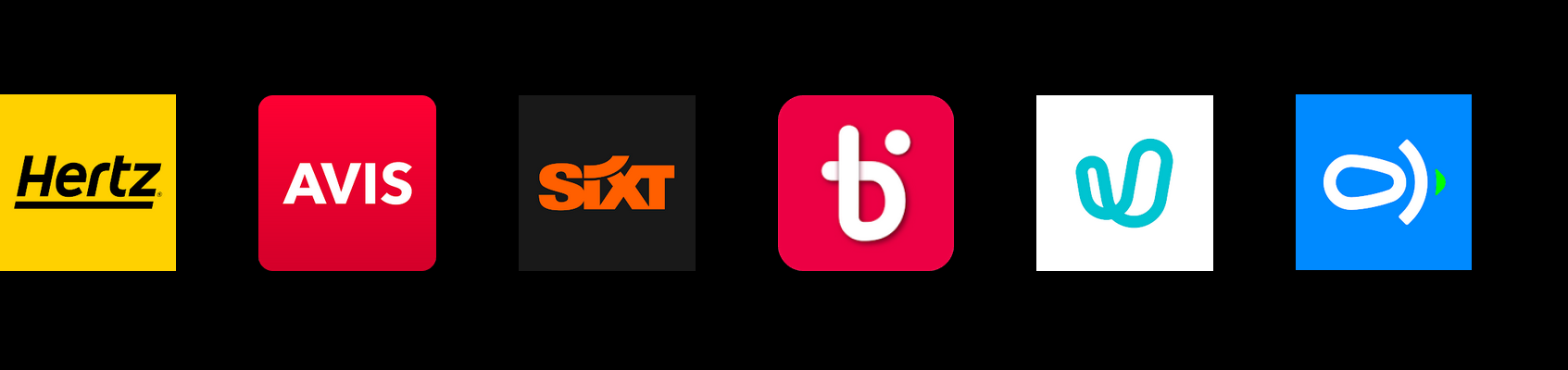
3. THE COMPETENCE.
The idea to explore this niche maybe comes from the fact that there are no competitors well established as luxury renters.
So the analyzed apps were:
![]()
Hertz, Avis, Sixt, Bipi, Ubeeqo and Cooltra.
Looking at them it is easy to see some patterns. However, the important thing here was not all those patterns that would be respected, but the one we would break. More on this in the next point.
The idea to explore this niche maybe comes from the fact that there are no competitors well established as luxury renters.
So the analyzed apps were:
Hertz, Avis, Sixt, Bipi, Ubeeqo and Cooltra.
Looking at them it is easy to see some patterns. However, the important thing here was not all those patterns that would be respected, but the one we would break. More on this in the next point.
👽️👽️👽️
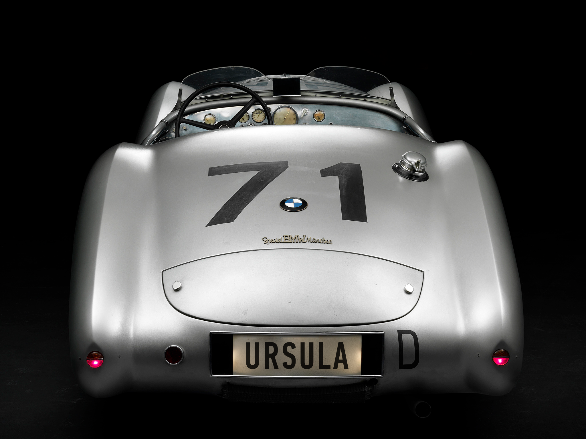
4. PERSONA
In this particular case we could agree that we have one big persona. We do not discriminate by gender or age, but we do by budget and car loving.
![]()
Ursula is a person who never says how old is s/he. So nobody knows. S/he holds a managerial position in the company in which works at the same time that controls some side business. S/he is competent enough to complete the process in e-shops without hesitation (mostly) but s/he can know when it feels harder than it should be. S/he loves cars and has no budget problems when s/he wants something. When renting a car, s/he does it for pleasure, and s/he is ready to enjoy the process itself.
In this particular case we could agree that we have one big persona. We do not discriminate by gender or age, but we do by budget and car loving.
Ursula is a person who never says how old is s/he. So nobody knows. S/he holds a managerial position in the company in which works at the same time that controls some side business. S/he is competent enough to complete the process in e-shops without hesitation (mostly) but s/he can know when it feels harder than it should be. S/he loves cars and has no budget problems when s/he wants something. When renting a car, s/he does it for pleasure, and s/he is ready to enjoy the process itself.
🛠️💣️🛠️
5. DESIGN
At this point I should start with the navigation flow and the wireframes but I really need a name for this :_S So, I decided to stretch my day-planning and to think on one. The best I had in one hour would be the name.
In the end I got to Minn. I liked the simplicity, the sound, the differentiation and the lack of pointing to anything (even when it emerged from Min, old god protector of the roads).
So, let's design Minn.
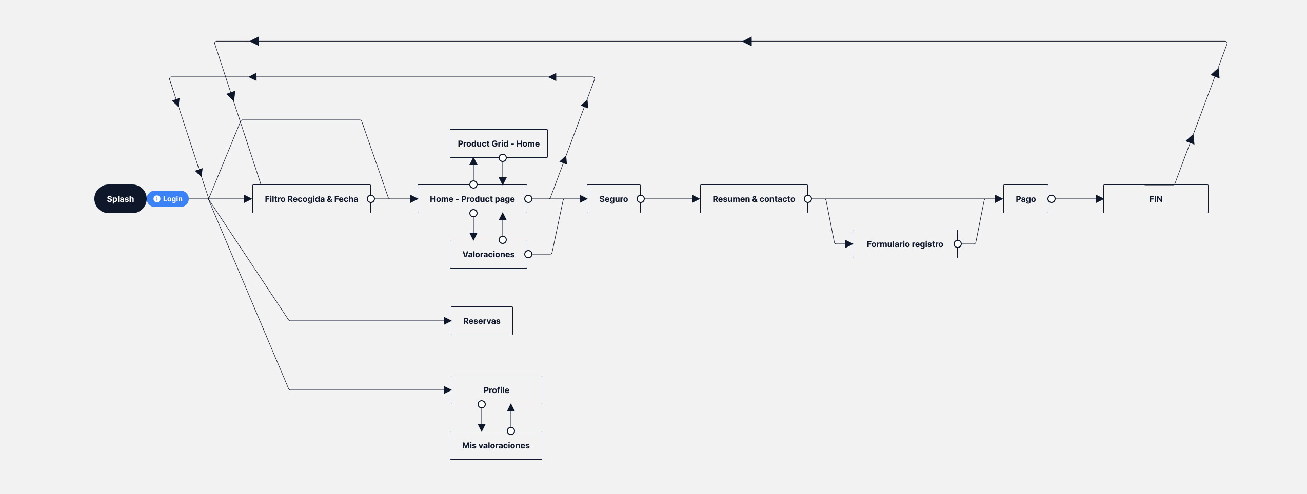
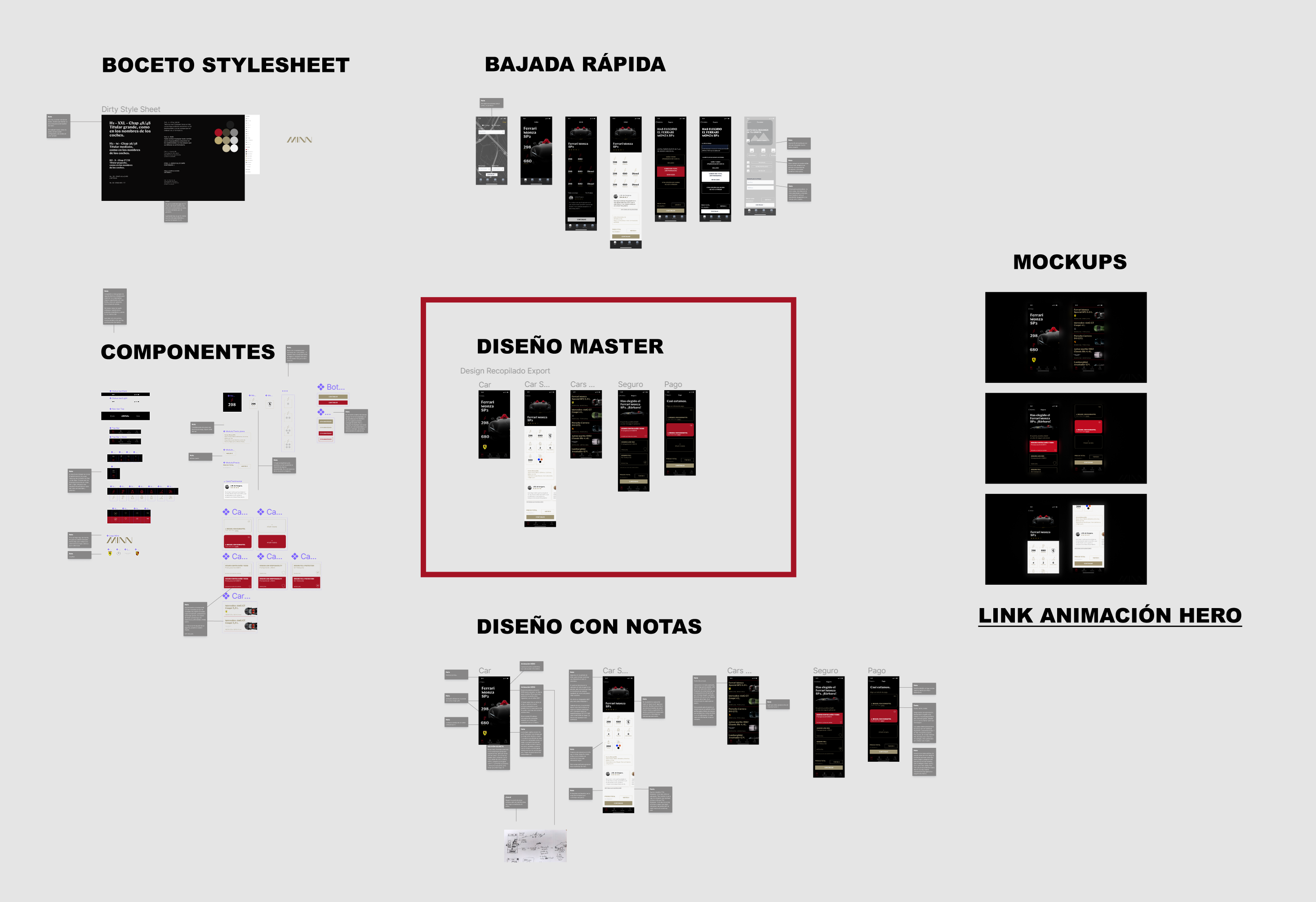
I started with post-its in order to play with different possibilities and I ended up with that.
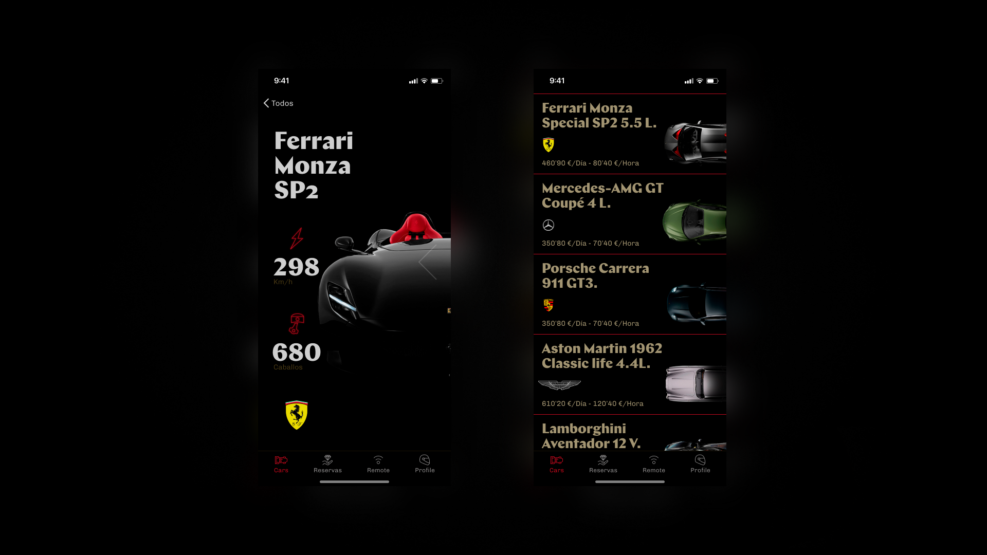
After login, you (user) can choose (or decline) date and place. Although it is not fancy (at all) this is a very important step since it is needed to avoid frustrations with availability.
After that you start to navigate through cars. And this is the main difference with most apps and with this luxury experience: you do not enter the grid at first; you enter a one-car-model screen and from there you can reach the typical grid and the search bar. More on this later.
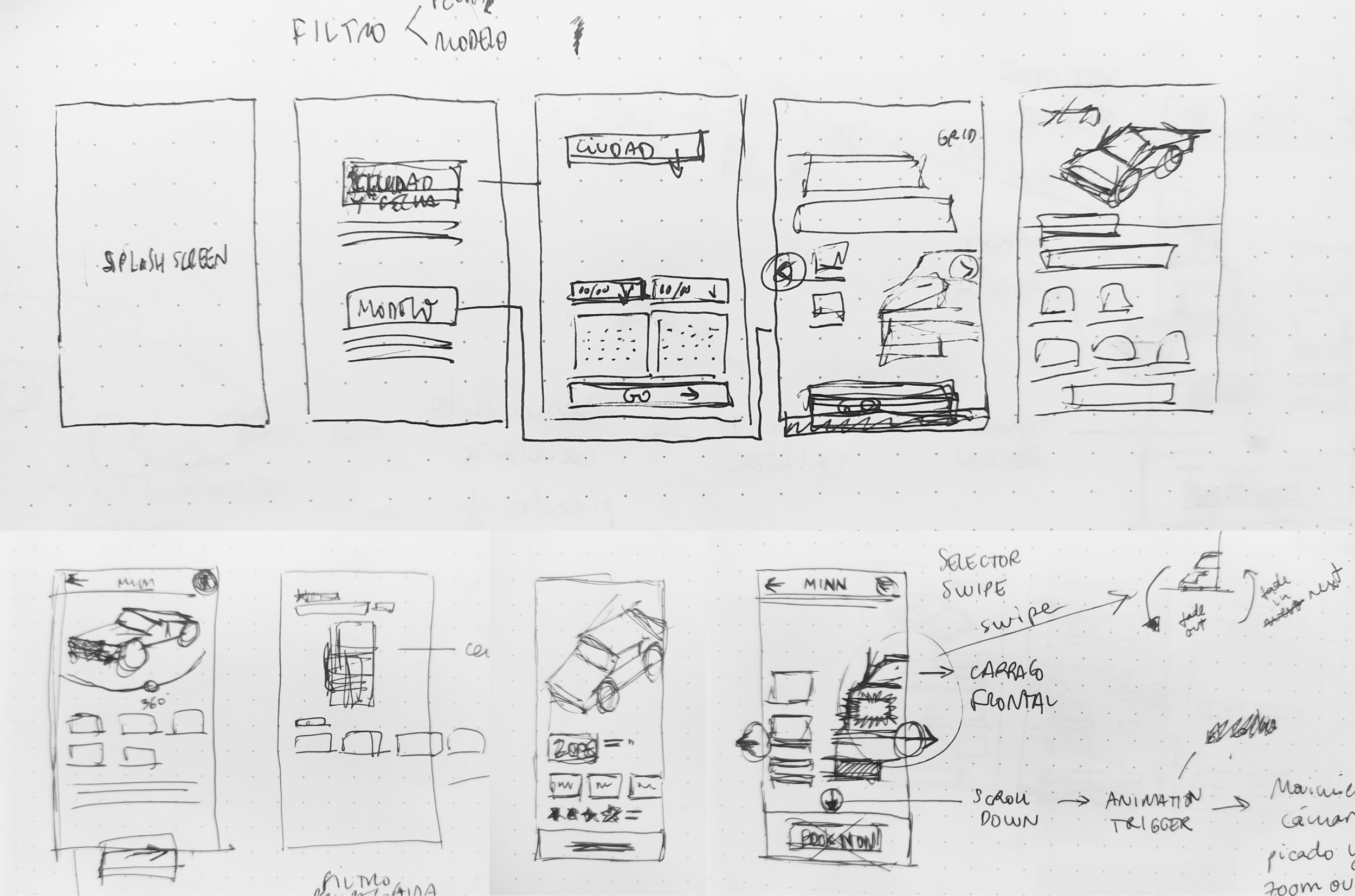
Due to the lack of time, I made a mix between low and medium wireframes.
After that, I started to dress Minn up 💄️ I decided which typefaces and colors will be used.
After that, I started to dress Minn up 💄️ I decided which typefaces and colors will be used.

Those values were tweaked going back and forth as I kept on designing.
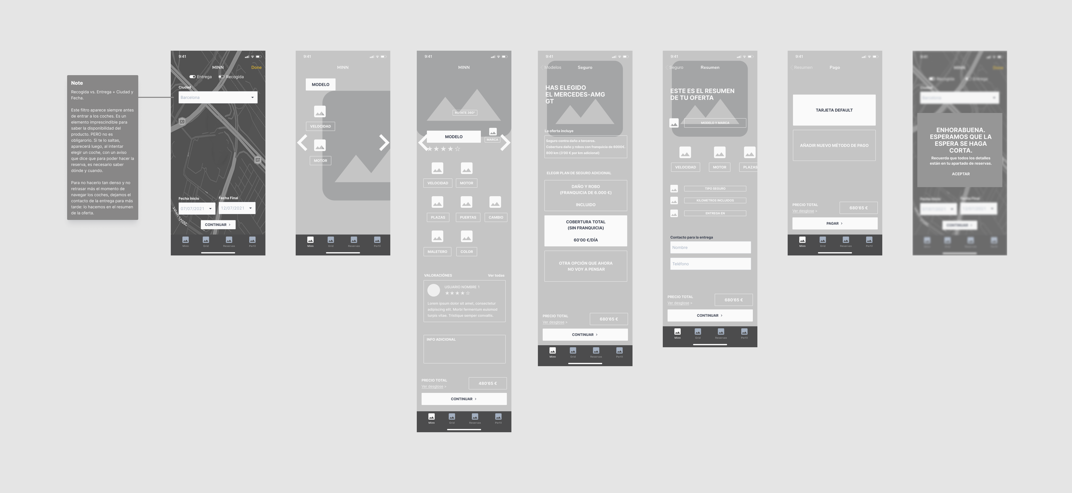
With the visual identity being established, I made a quick drawing of the main screens.
With the visual identity being established, I made a quick drawing of the main screens.
I skipped the map screen because the main element was the map and it takes a while to get a cool map in tools like snazzymaps. So I decided to move on and leave it in medium quality.
As I said, a quick drawing, no pixel perfect, no component thinking, just layout, positioning and general visual.
Then, I design the screens more in depth.
As I said, a quick drawing, no pixel perfect, no component thinking, just layout, positioning and general visual.
Then, I design the screens more in depth.
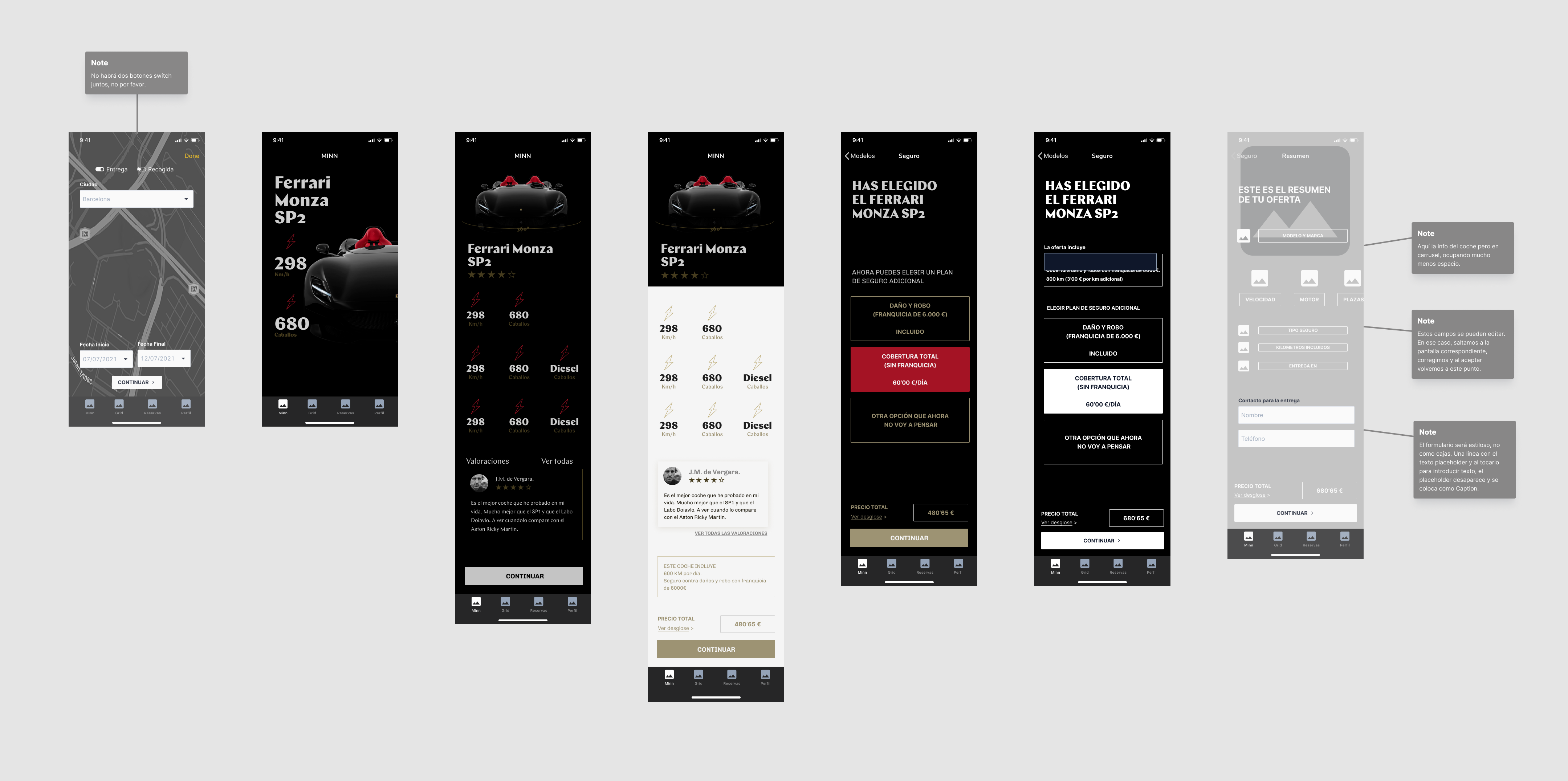
There are some important points here that depend on all the previous decisions. Some of them:
👉 As we already know, the navigation starts within a one-car screen.
👉 In that screen, only model, speed, power and brand are displayed. We knew that model and brand are the main drivers.
👉 About interaction: movement plays a fundamental role to feel the quality of the product and it is essential to achieve the exclusivity we looked for. The main interaction is a well known pattern: swipe right/left to go to the next/previous model (you will see that movement later on). A second big animation is thought to serve as a transition between this frontal view and the 360º view triggered with scroll down (you will not see that one :P). No price is shown at first.
👉 Different images of the car are displayed on each screen. This is also in order to look high end.
👉 On the car-grid screen focus is on models and brands. Price has a lower hierarchy and is displayed in to formats: €/day & €/hour.
👉 Cards on car-grid have a generous height.
👉 The hierarchy overall is well balanced and information is displayed in a clean way.
👉 Everything grows up from an 8pt grid system.
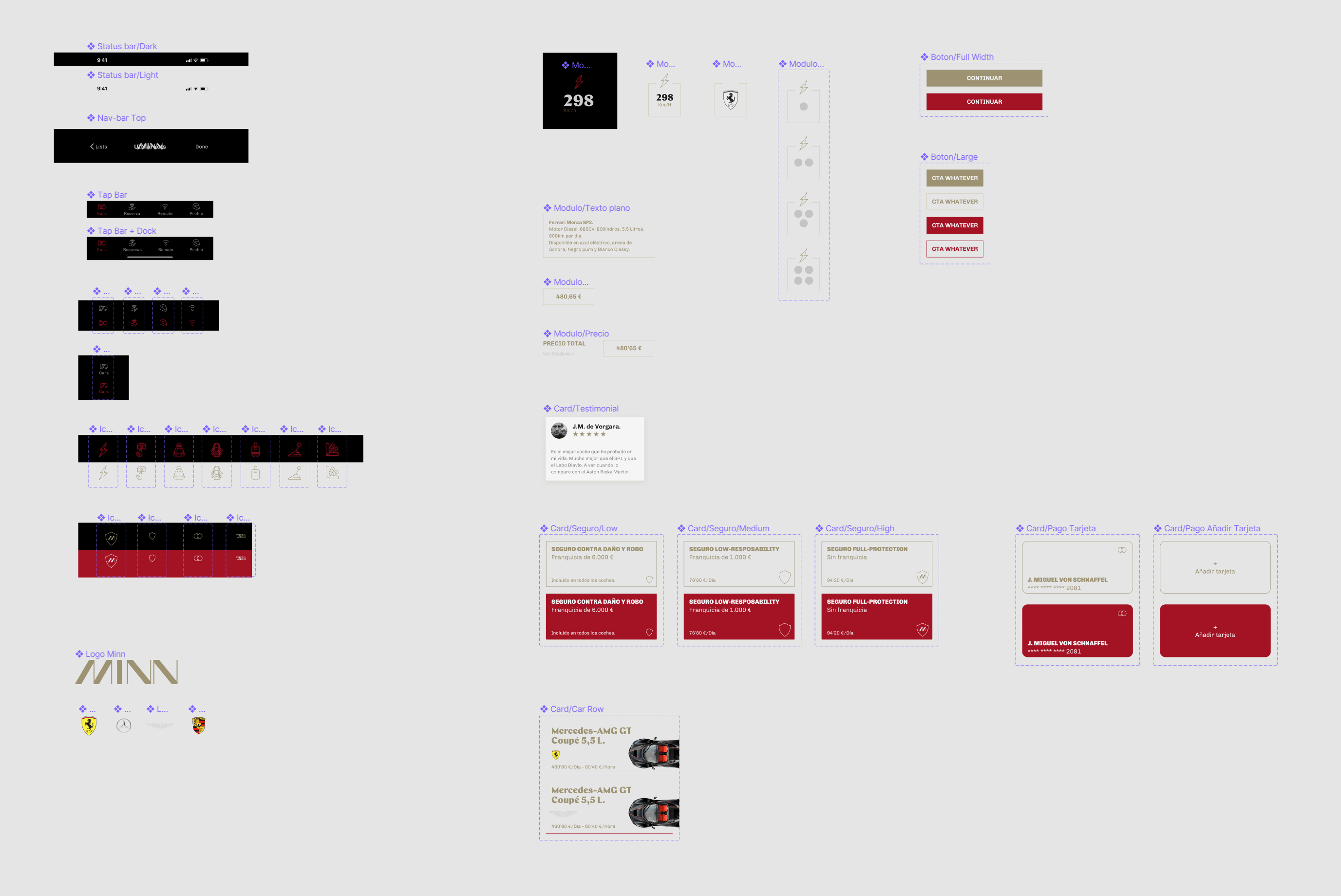
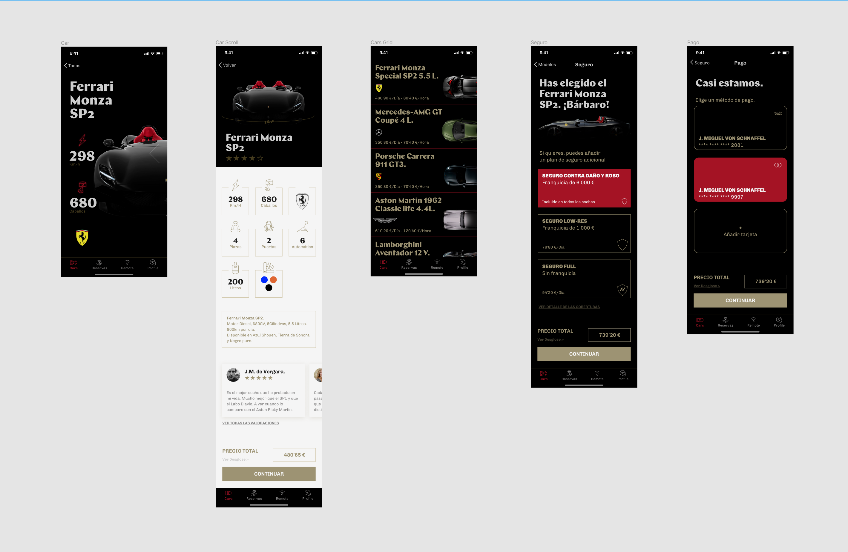
All components were made with autolayout, autolayout+variants or just simple constraints depending on my actual needs or my prevision.
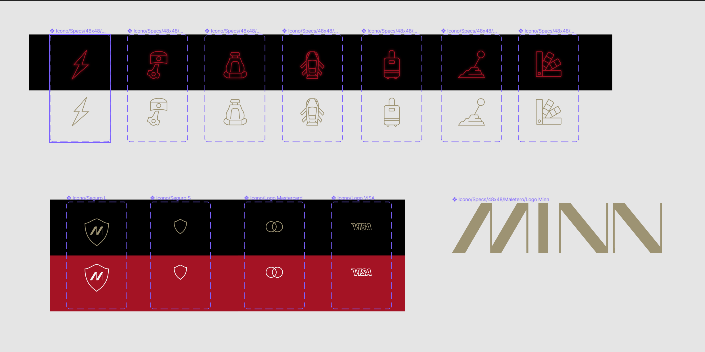
I designed the main icons inside Figma (in a proper grid) <3 Also the logo. It is not the best logo ever, but good enough by now.
I designed the main icons inside Figma (in a proper grid) <3 Also the logo. It is not the best logo ever, but good enough by now.

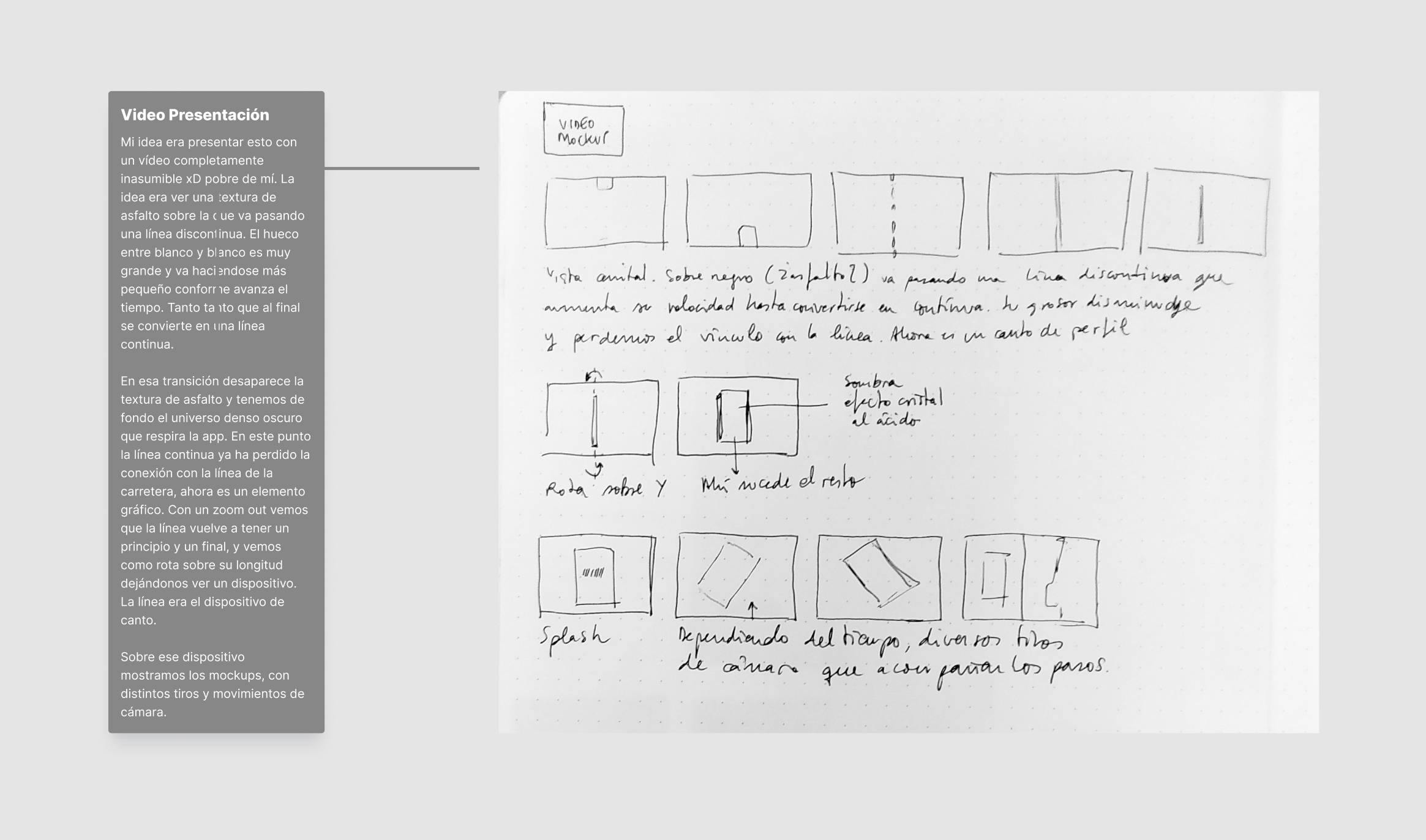
I prioritized the main interaction of the app over a simple prototype. So I animated on after effects the micro animations of the product page.

With the design ready, the last step was sharing with the agency the figma file, well organized and commented.
🔮🔮🔮
6. Final conclusions.
When trying to get -from scratch- some kind of good-looking product within such a short time -four days-, planning and prioritization is essential: you have to know in which nests you will put your eggs because, for sure, a bunch of things are going to be left out. With the information available and the brief's origin (an ux agency) this was the path I followed, but probably it would have been different in a different context.
When trying to get -from scratch- some kind of good-looking product within such a short time -four days-, planning and prioritization is essential: you have to know in which nests you will put your eggs because, for sure, a bunch of things are going to be left out. With the information available and the brief's origin (an ux agency) this was the path I followed, but probably it would have been different in a different context.
🩰🩰🩰
7. Extra ball.
I would definitely love to go beyond these four days as I had projected an apple watch integration to open the cars and I would have loved designing it. Also, a little motion for the app presentation was thought of.
I would definitely love to go beyond these four days as I had projected an apple watch integration to open the cars and I would have loved designing it. Also, a little motion for the app presentation was thought of.

If you reached this, you are wonderful <3
Thanks for reading.
Thanks for reading.
Designer. Focus on product, UX & UI. Background in Art Direction and Motion Graphics. Sometimes I make books.
I was born in![]() on a 4th of July and some consequences had to remain, of course. In winter I like to use the
on a 4th of July and some consequences had to remain, of course. In winter I like to use the ![]() . It is ugly. Indeed. But I can reach the 39 Celsius degrees that welcomed me into this world. And what a world.
. It is ugly. Indeed. But I can reach the 39 Celsius degrees that welcomed me into this world. And what a world.
![]()
![]()
![]()
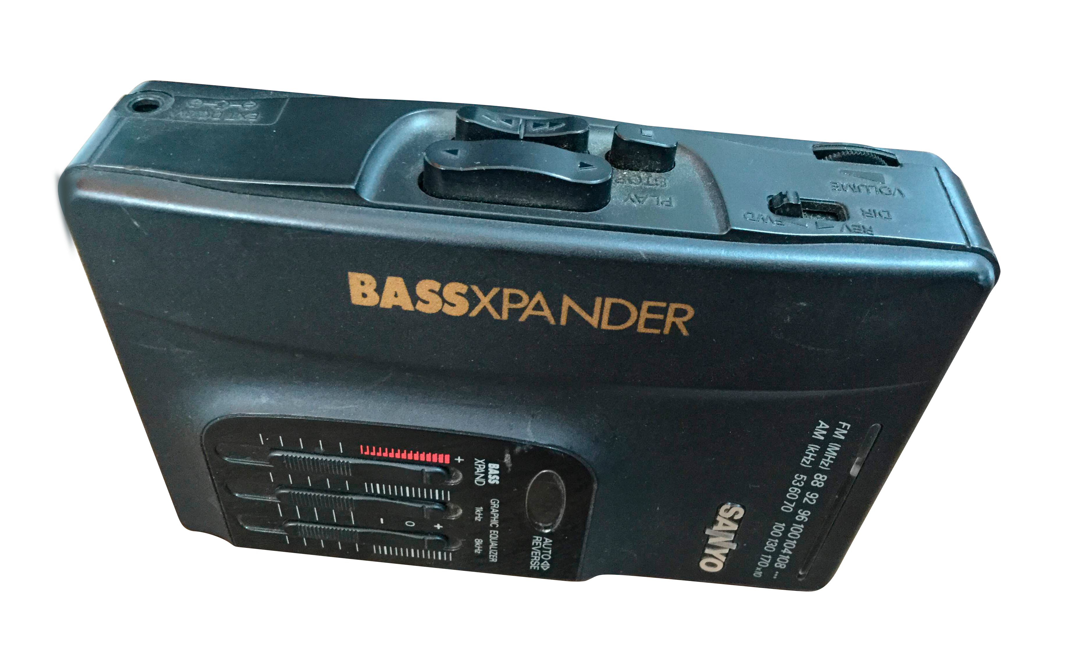
![]() (I said Sanyo, is not a typo). Mortadella sandwiches with lemon Kas.
(I said Sanyo, is not a typo). Mortadella sandwiches with lemon Kas. ![]()
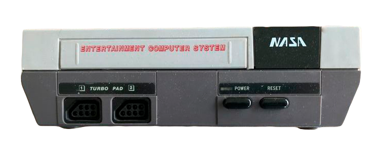
![]() (I said NASA, is not another typo). And screens with the same resolution. ALL. OF. THEM.
(I said NASA, is not another typo). And screens with the same resolution. ALL. OF. THEM.
I especially like typeface, grids and things in movement. Some time ago I used to work on advertising.![]()
Someone who read this could think that Helvetica is such a boring choice for a typeface lover. And this person could be completely right on this point.
But this is not Helvetica :)
No, no. It is![]() Neue Haas Grotesk
I like it <3 Easy.
Neue Haas Grotesk
I like it <3 Easy.
Speaking of something else, I like software. This can be weird, but is not false. I was from Figma when Adobe had not even heard of it and most of us were still using Sketch. I love Blender. Terrific piece of software and terrific project. I switched from Notion to Anytype. In Windows I use a very ugly font manager that I cannot recommend enough, despite its awful client service Maintype︎︎︎. In Mac I use RightFont. And of course, I took distance with Adobe and started using Affinity Serif. That being said, eternal respect for InDesign and its incredible baseline grid ❤️. And hate-love for AE.
In my spare time I do things like this︎︎︎ or this︎︎︎. Although I would like to do things like this︎︎︎, this︎︎︎ or this︎︎︎.
And that's all.
By now.
I was born in
Kansas City

"mesa camilla"
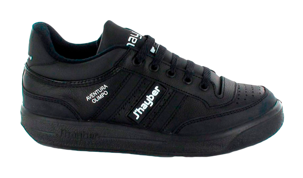
J'haybers,
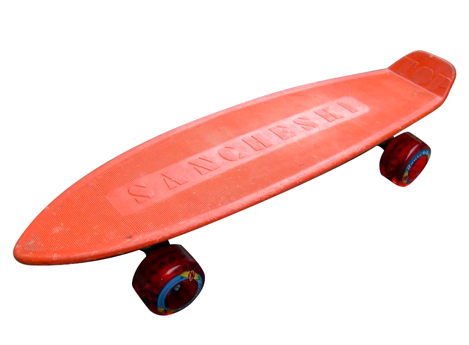
orange Sancheski,
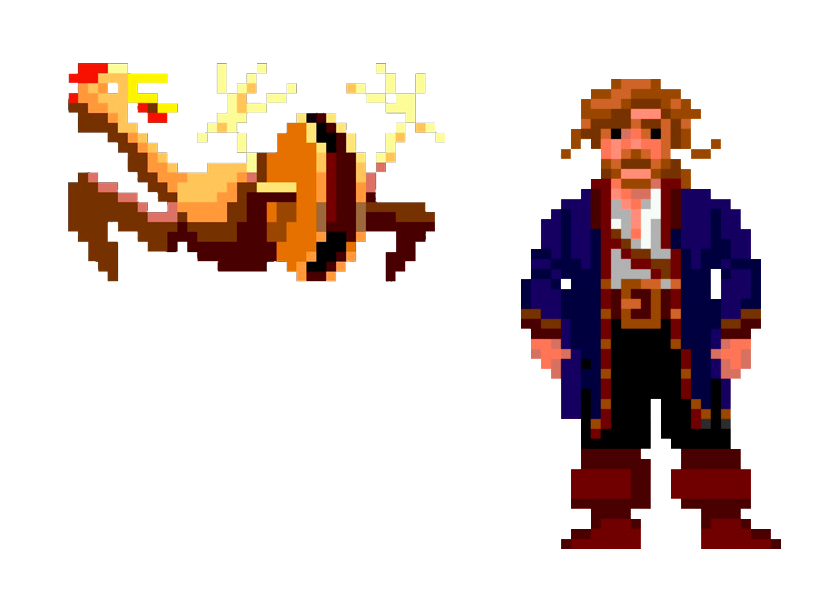
Monkey Island,
Sanyo with megabass
NASA
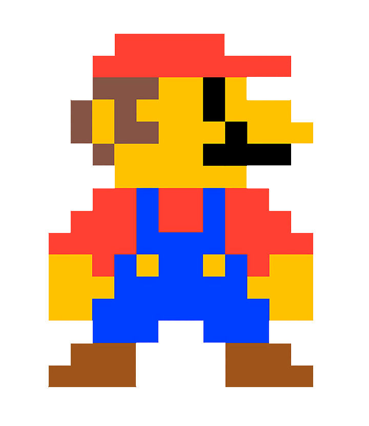
with Mario Bros
I especially like typeface, grids and things in movement. Some time ago I used to work on advertising.
It’s worse to beg.
Someone who read this could think that Helvetica is such a boring choice for a typeface lover. And this person could be completely right on this point.
But this is not Helvetica :)
No, no. It is
Christian Schwartz's

Speaking of something else, I like software. This can be weird, but is not false. I was from Figma when Adobe had not even heard of it and most of us were still using Sketch. I love Blender. Terrific piece of software and terrific project. I switched from Notion to Anytype. In Windows I use a very ugly font manager that I cannot recommend enough, despite its awful client service Maintype︎︎︎. In Mac I use RightFont. And of course, I took distance with Adobe and started using Affinity Serif. That being said, eternal respect for InDesign and its incredible baseline grid ❤️. And hate-love for AE.
In my spare time I do things like this︎︎︎ or this︎︎︎. Although I would like to do things like this︎︎︎, this︎︎︎ or this︎︎︎.
And that's all.
By now.