Cada uno ve lo que sabe.
Book design.
Conoscere le immagini che ci circondano vuol dire anche allargare le possibilità di contatti con la realtà, vuol dire vedere di più e capire di più.
Bruno Munari.
︎
Yes, Bruno Munari was clear about it: the more you know, the more you see. So do Anna Juan and Piu Martínez, the authors of
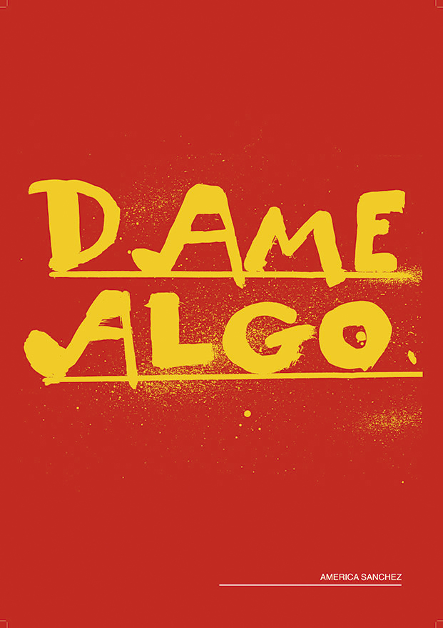
Cada uno ve lo que sabe, an essay about reading images with no images.
Yep.
Yep.


💣️💣️💣️
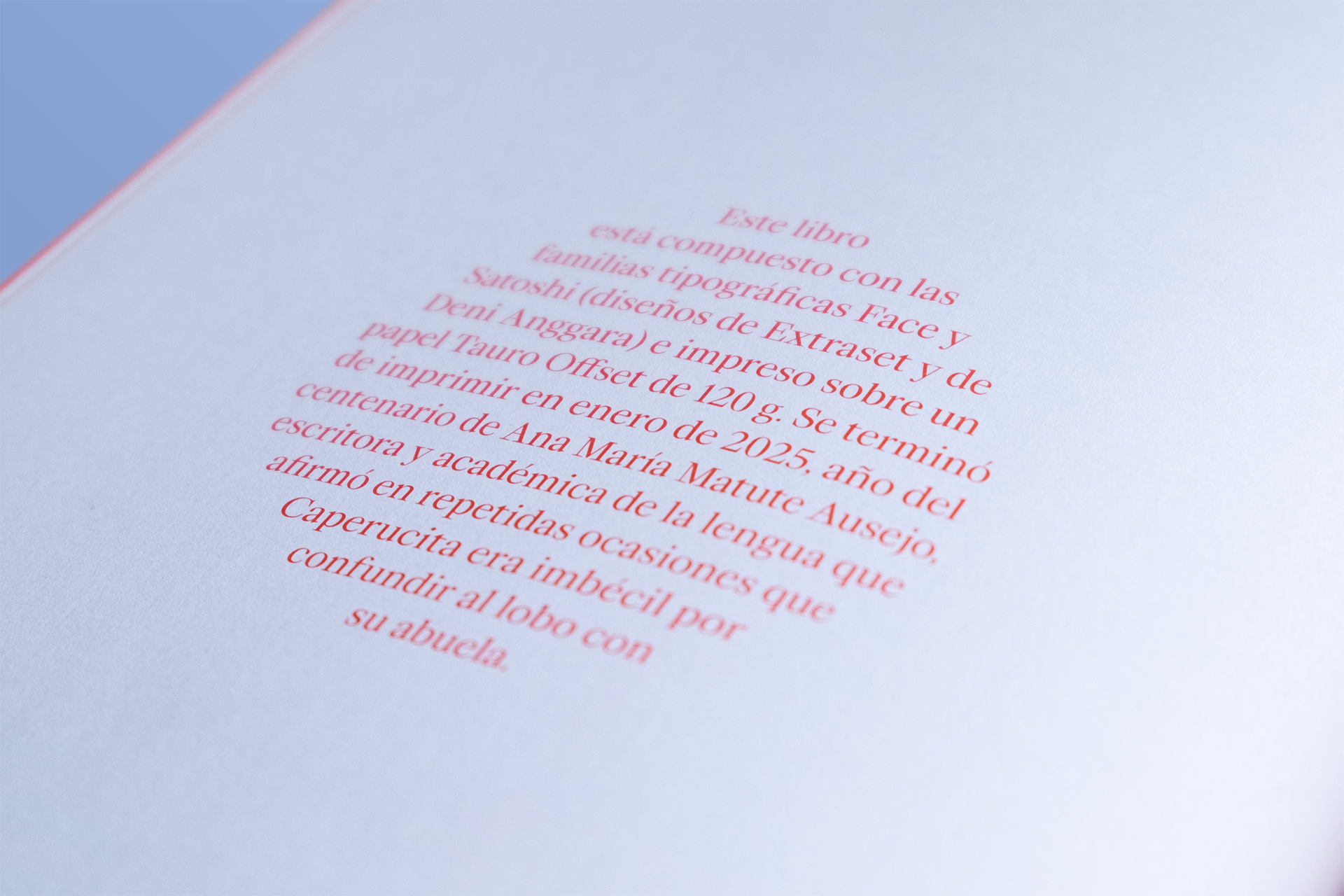
Piu and Anna wrote a delightful guide about images and children’s picturebooks, and I was very lucky to be commissioned by GG Publisher to give shape to such a singular book.
The book is not intended to be a technical or strictly academic document, but rather an informative tool aimed at offering some basic coordinates from which to learn how to look at picturebooks and read images. It is an approach to the picture book as a tool to initiate or enhance visual literacy, and also as a vehicle for learning to read multiple forms of language.
From the very beginning, it was a requirement in the briefing that the design should go hand in hand with everything conveyed in the book and serve as an example for some of the material aspects of picture book production discussed in the essay.


✨️✨️✨️
A special thanks to the entire publishing team (Saskia, María Serrano, Nura...) for their warm welcome and professionalism, but especially to Aina and Heura (Editorial Director and Art Director) for letting us play, for being open to unorthodox design decisions, and above all, for accepting (and loving) this back cover.

🔈🔈🔈
If you are interested in the subject and understand Spanish or Catalan, you can listen to these interviews with the authors on Radio 3 and Catalunya Ràdio.

Designer. Focus on product, UX & UI. Background in Art Direction and Motion Graphics. Sometimes I make books.
I was born in![]() on a 4th of July and some consequences had to remain, of course. In winter I like to use the
on a 4th of July and some consequences had to remain, of course. In winter I like to use the ![]() . It is ugly. Indeed. But I can reach the 39 Celsius degrees that welcomed me into this world. And what a world.
. It is ugly. Indeed. But I can reach the 39 Celsius degrees that welcomed me into this world. And what a world.
![]()
![]()
![]()
![]() (I said Sanyo, is not a typo). Mortadella sandwiches with lemon Kas.
(I said Sanyo, is not a typo). Mortadella sandwiches with lemon Kas. ![]()
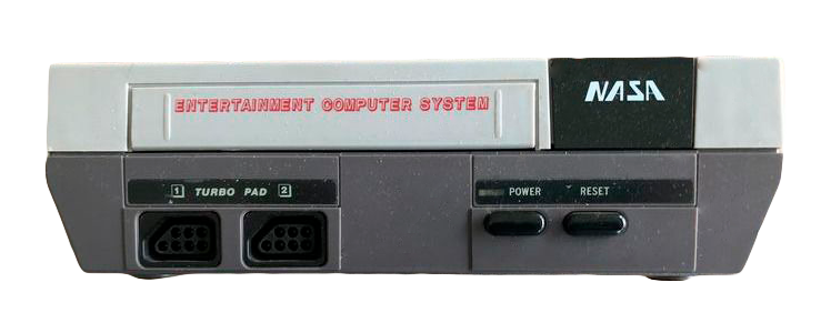
![]() (I said NASA, is not another typo). And screens with the same resolution. ALL. OF. THEM.
(I said NASA, is not another typo). And screens with the same resolution. ALL. OF. THEM.
I especially like typeface, grids and things in movement. Some time ago I used to work on advertising.![]()
Someone who read this could think that Helvetica is such a boring choice for a typeface lover. And this person could be completely right on this point.
But this is not Helvetica :)
No, no. It is![]() Neue Haas Grotesk
I like it <3 Easy.
Neue Haas Grotesk
I like it <3 Easy.
Speaking of something else, I like software. This can be weird, but is not false. I was from Figma when Adobe had not even heard of it and most of us were still using Sketch. I love Blender. Terrific piece of software and terrific project. I switched from Notion to Anytype. In Windows I use a very ugly font manager that I cannot recommend enough, despite its awful client service Maintype︎︎︎. In Mac I use RightFont. And of course, I took distance with Adobe and started using Affinity Serif. That being said, eternal respect for InDesign and its incredible baseline grid ❤️. And hate-love for AE.
In my spare time I do things like this︎︎︎ or this︎︎︎. Although I would like to do things like this︎︎︎, this︎︎︎ or this︎︎︎.
And that's all.
By now.
I was born in
Kansas City

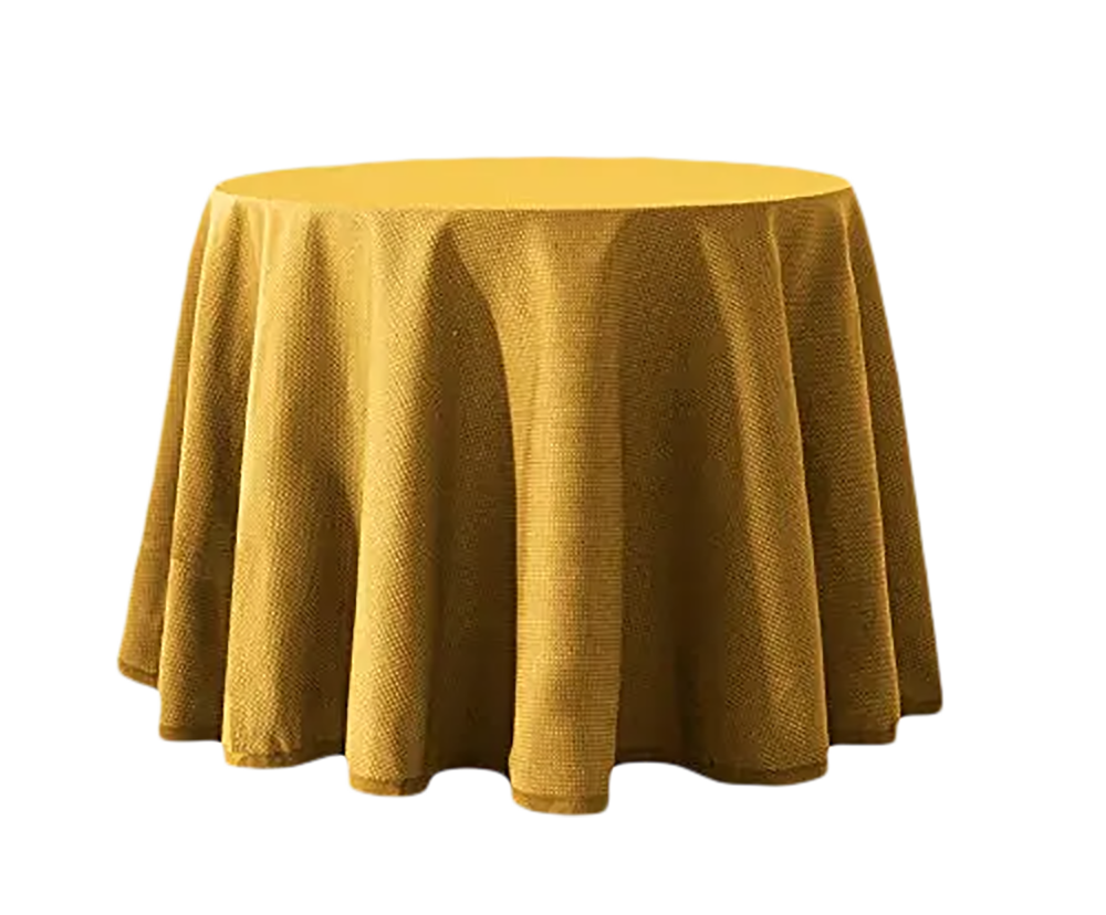
"mesa camilla"
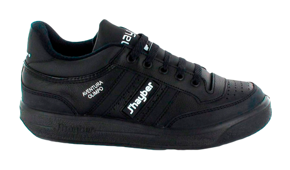
J'haybers,
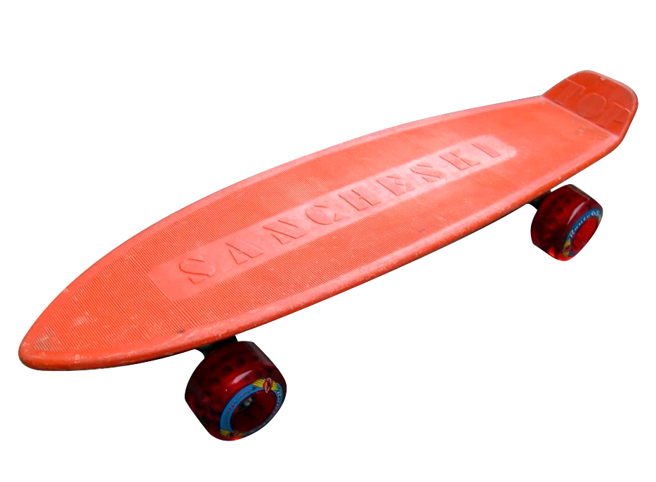
orange Sancheski,
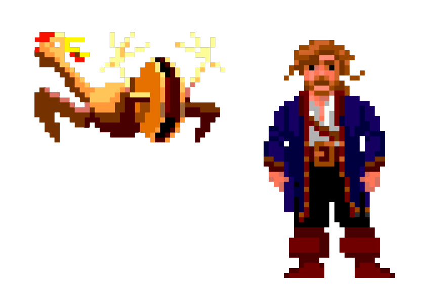
Monkey Island,
Sanyo with megabass

NASA
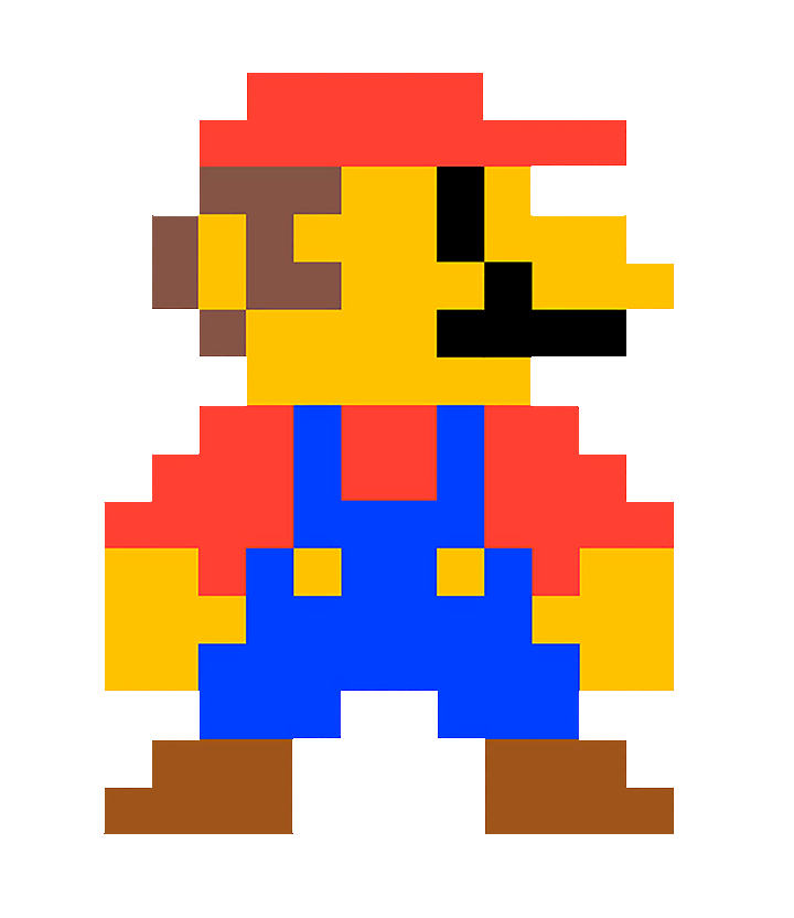
with Mario Bros
I especially like typeface, grids and things in movement. Some time ago I used to work on advertising.
It’s worse to beg.
Someone who read this could think that Helvetica is such a boring choice for a typeface lover. And this person could be completely right on this point.
But this is not Helvetica :)
No, no. It is
Christian Schwartz's

Speaking of something else, I like software. This can be weird, but is not false. I was from Figma when Adobe had not even heard of it and most of us were still using Sketch. I love Blender. Terrific piece of software and terrific project. I switched from Notion to Anytype. In Windows I use a very ugly font manager that I cannot recommend enough, despite its awful client service Maintype︎︎︎. In Mac I use RightFont. And of course, I took distance with Adobe and started using Affinity Serif. That being said, eternal respect for InDesign and its incredible baseline grid ❤️. And hate-love for AE.
In my spare time I do things like this︎︎︎ or this︎︎︎. Although I would like to do things like this︎︎︎, this︎︎︎ or this︎︎︎.
And that's all.
By now.