Diseñador gráfico. Autodidacta. Director de arte. Motion grapher. Salao.
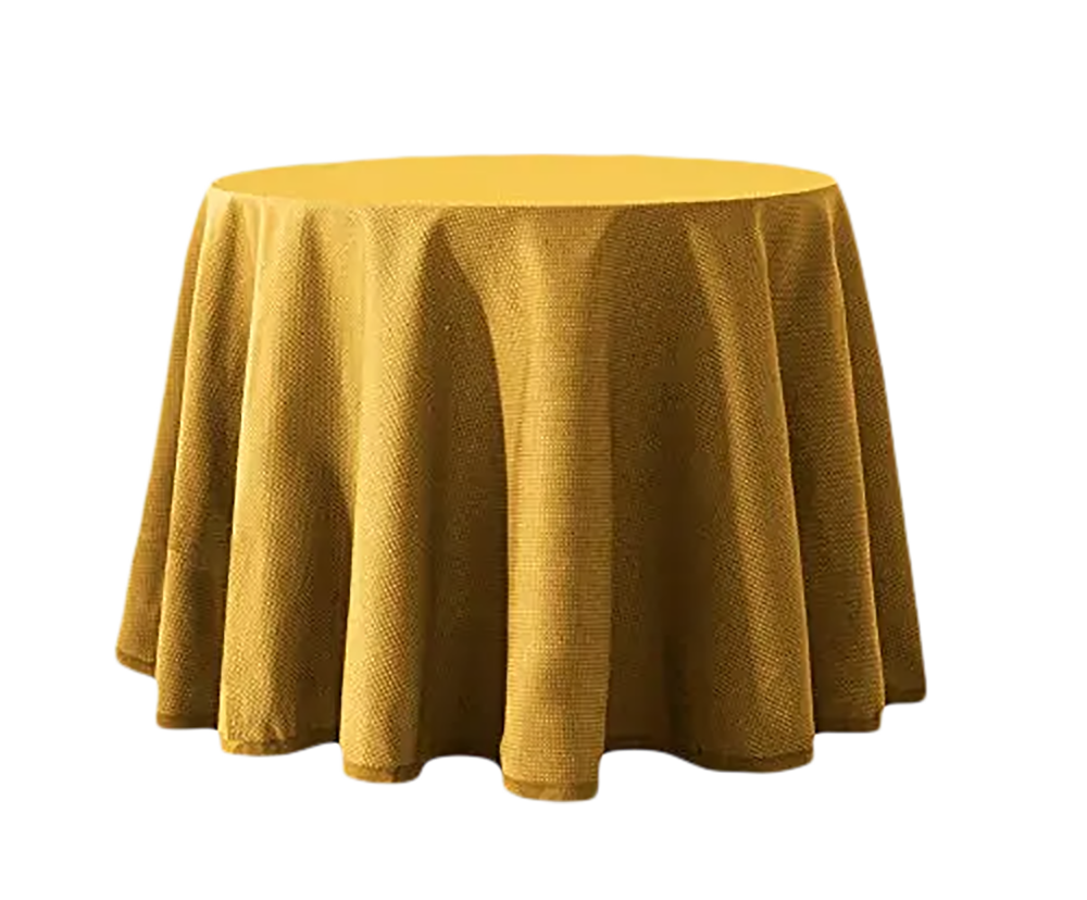
Nací en Kansas City un cuatro de julio a 39 grados y alguna secuela tenía que quedar, claro. En invierno me gusta poner la mesa camilla. Es fea, sí. Pero alcanzo los 39 grados con los que me recibió este mundo. Y qué mundo.
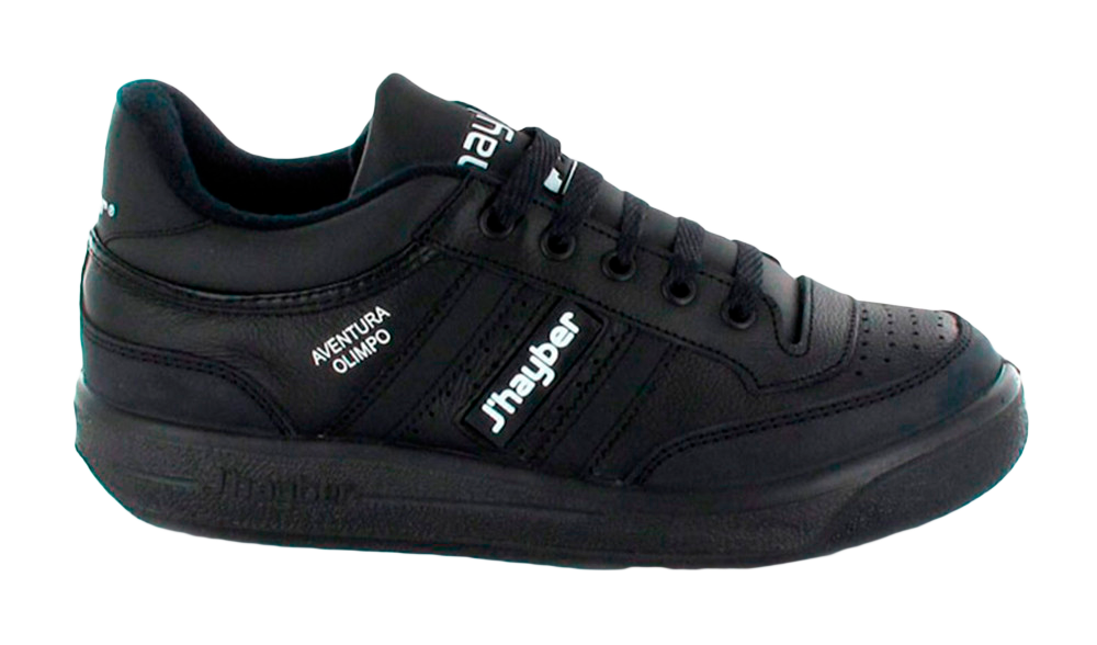
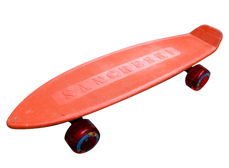
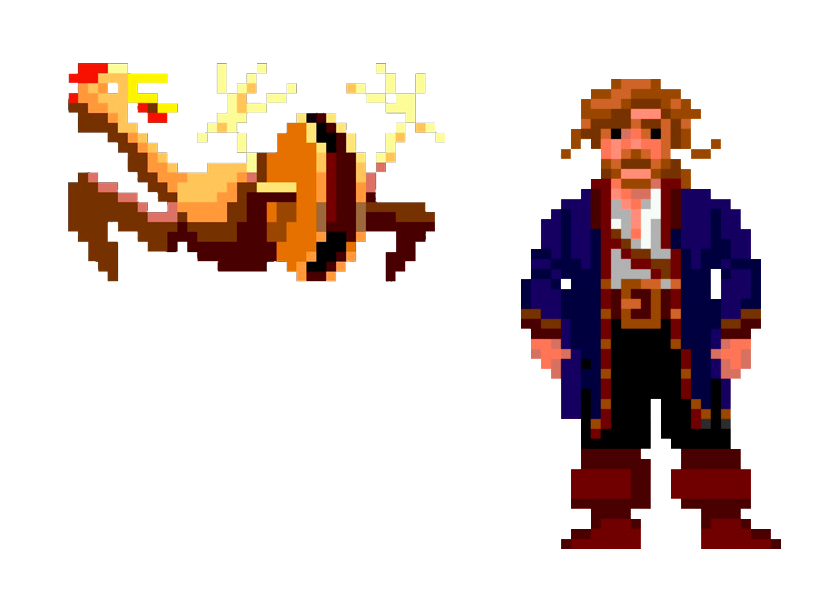
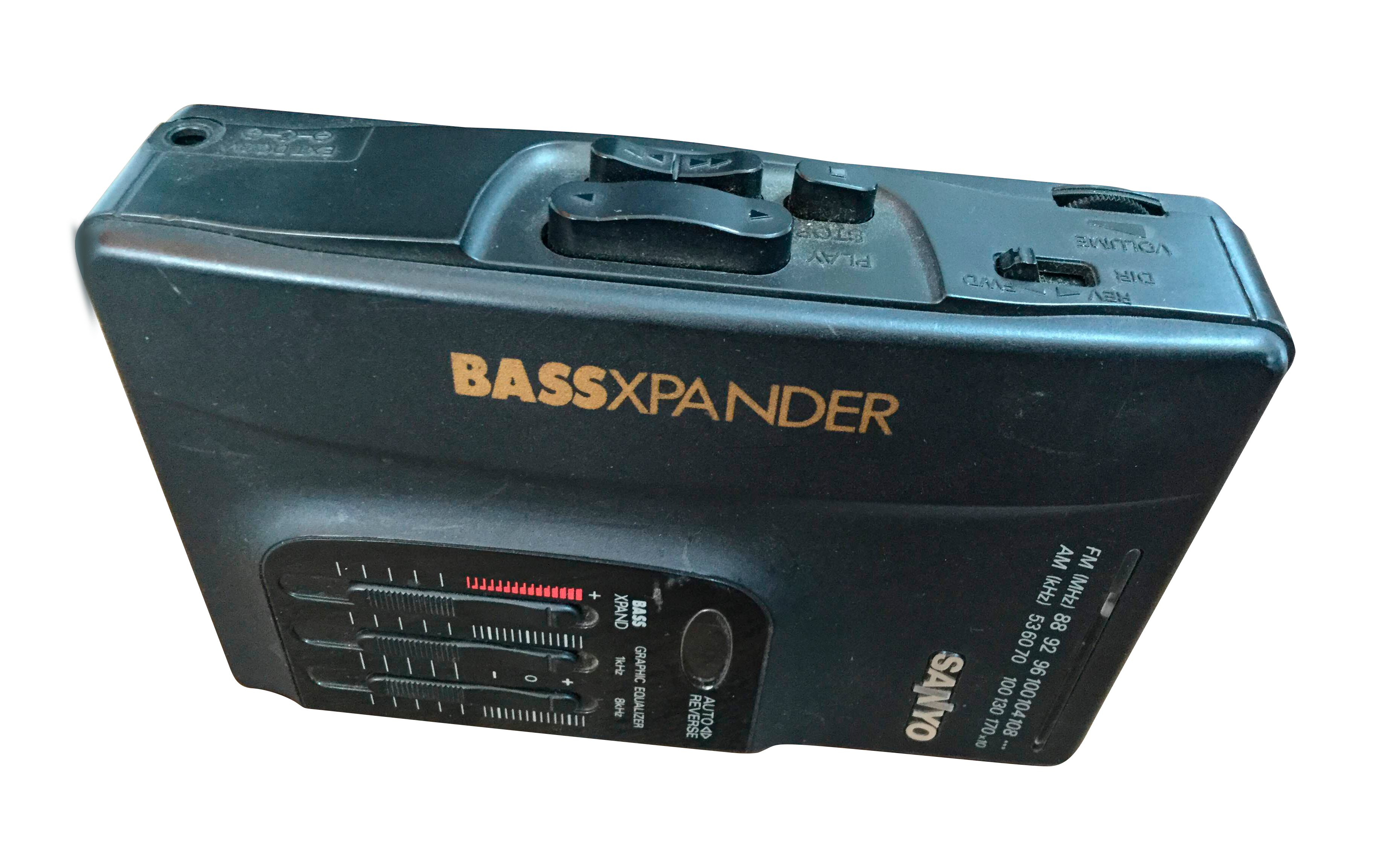
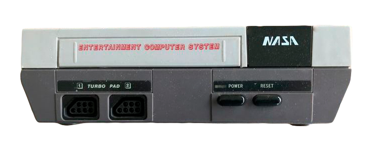
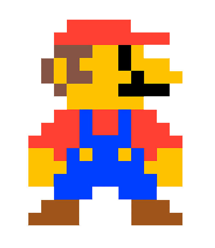
J’haybers, Sanchesky naranja, Monkey Island, Sanyo con megabass (Sanyo, Sanyo, no es un typo). Bocadillos de mortadela con Kas de limón. Nasa con Mario Bros (Nasa, Nasa, no es otro typo). Y pantallas con doscientos catorce tipos de resolución menos que ahora.
Qué mundo.
Me gustan especialmente la tipografía, los layouts y las cosas que se mueven. A veces hago publicidad. Más feo es pedir.
Alguien que lea esto podría pensar que para gustarme la tipografía, que vaya aburrimiento con la Helvética. Y puede que no le faltara razón en que la Helvética aburre.
Pero esto no es Helvética :)
No, no. Es la Neue Haal Grotesk de Christian Schwartz y me gusta mucho <3 ¿Aburrida? Tal vez. Pero en dos años será menos aburrida que todas las extended-deformaditas-variables-hype del momento. Que hasta se ha recuperado la Copperplate. Señor.
Cambiendo de tema: me gusta el software. Puede ser raro pero no falso. Soy de Figma (ciao Sketch 😘️), Da Vinci y Blender. Notion es top. Utilizo un gestor de tipos feísimo que no puedo parar de recomendar a pesar de que su SAT es un poco meh: Maintype︎︎︎. He dicho que es feo, terrible, pero qué layout precioso te puedes montar. Y por supuesto, soy de Indesign -baseline grid ❤️️- y de After.
Dedico parte de mi tiempo libre a hacer cosas como esta︎︎︎ o esta︎︎︎. Aunque me gustaría hacer cosas como esta︎︎︎, esta︎︎︎ o esta︎︎︎.
Y poco más.
Por ahora.
Nací en Kansas City un cuatro de julio a 39 grados y alguna secuela tenía que quedar, claro. En invierno me gusta poner la mesa camilla. Es fea, sí. Pero alcanzo los 39 grados con los que me recibió este mundo. Y qué mundo.
J’haybers, Sanchesky naranja, Monkey Island, Sanyo con megabass (Sanyo, Sanyo, no es un typo). Bocadillos de mortadela con Kas de limón. Nasa con Mario Bros (Nasa, Nasa, no es otro typo). Y pantallas con doscientos catorce tipos de resolución menos que ahora.
Qué mundo.
Me gustan especialmente la tipografía, los layouts y las cosas que se mueven. A veces hago publicidad. Más feo es pedir.
Alguien que lea esto podría pensar que para gustarme la tipografía, que vaya aburrimiento con la Helvética. Y puede que no le faltara razón en que la Helvética aburre.
Pero esto no es Helvética :)
No, no. Es la Neue Haal Grotesk de Christian Schwartz y me gusta mucho <3 ¿Aburrida? Tal vez. Pero en dos años será menos aburrida que todas las extended-deformaditas-variables-hype del momento. Que hasta se ha recuperado la Copperplate. Señor.
Cambiendo de tema: me gusta el software. Puede ser raro pero no falso. Soy de Figma (ciao Sketch 😘️), Da Vinci y Blender. Notion es top. Utilizo un gestor de tipos feísimo que no puedo parar de recomendar a pesar de que su SAT es un poco meh: Maintype︎︎︎. He dicho que es feo, terrible, pero qué layout precioso te puedes montar. Y por supuesto, soy de Indesign -baseline grid ❤️️- y de After.
Dedico parte de mi tiempo libre a hacer cosas como esta︎︎︎ o esta︎︎︎. Aunque me gustaría hacer cosas como esta︎︎︎, esta︎︎︎ o esta︎︎︎.
Y poco más.
Por ahora.
Designer. Focus on product, UX & UI. Background in Art Direction and Motion Graphics. Sometimes I make books.
I was born in![]() on a 4th of July and some consequences had to remain, of course. In winter I like to use the
on a 4th of July and some consequences had to remain, of course. In winter I like to use the ![]() . It is ugly. Indeed. But I can reach the 39 Celsius degrees that welcomed me into this world. And what a world.
. It is ugly. Indeed. But I can reach the 39 Celsius degrees that welcomed me into this world. And what a world.
![]()
![]()
![]()
![]() (I said Sanyo, is not a typo). Mortadella sandwiches with lemon Kas.
(I said Sanyo, is not a typo). Mortadella sandwiches with lemon Kas. ![]()
![]() (I said NASA, is not another typo). And screens with the same resolution. ALL. OF. THEM.
(I said NASA, is not another typo). And screens with the same resolution. ALL. OF. THEM.
I especially like typeface, grids and things in movement. Some time ago I used to work on advertising.![]()
Someone who read this could think that Helvetica is such a boring choice for a typeface lover. And this person could be completely right on this point.
But this is not Helvetica :)
No, no. It is![]() Neue Haas Grotesk
I like it <3 Easy.
Neue Haas Grotesk
I like it <3 Easy.
Speaking of something else, I like software. This can be weird, but is not false. I was from Figma when Adobe had not even heard of it and most of us were still using Sketch. I love Blender. Terrific piece of software and terrific project. I switched from Notion to Anytype. In Windows I use a very ugly font manager that I cannot recommend enough, despite its awful client service Maintype︎︎︎. In Mac I use RightFont. And of course, I took distance with Adobe and started using Affinity Serif. That being said, eternal respect for InDesign and its incredible baseline grid ❤️. And hate-love for AE.
In my spare time I do things like this︎︎︎ or this︎︎︎. Although I would like to do things like this︎︎︎, this︎︎︎ or this︎︎︎.
And that's all.
By now.
I was born in
Kansas City

"mesa camilla"
J'haybers,
orange Sancheski,
Monkey Island,
Sanyo with megabass
NASA
with Mario Bros
I especially like typeface, grids and things in movement. Some time ago I used to work on advertising.
It’s worse to beg.
Someone who read this could think that Helvetica is such a boring choice for a typeface lover. And this person could be completely right on this point.
But this is not Helvetica :)
No, no. It is
Christian Schwartz's

Speaking of something else, I like software. This can be weird, but is not false. I was from Figma when Adobe had not even heard of it and most of us were still using Sketch. I love Blender. Terrific piece of software and terrific project. I switched from Notion to Anytype. In Windows I use a very ugly font manager that I cannot recommend enough, despite its awful client service Maintype︎︎︎. In Mac I use RightFont. And of course, I took distance with Adobe and started using Affinity Serif. That being said, eternal respect for InDesign and its incredible baseline grid ❤️. And hate-love for AE.
In my spare time I do things like this︎︎︎ or this︎︎︎. Although I would like to do things like this︎︎︎, this︎︎︎ or this︎︎︎.
And that's all.
By now.